Inside the colourful house from our AW24 photoshoot
Interior designer Rhonda Drakeford on creating the House of Colour
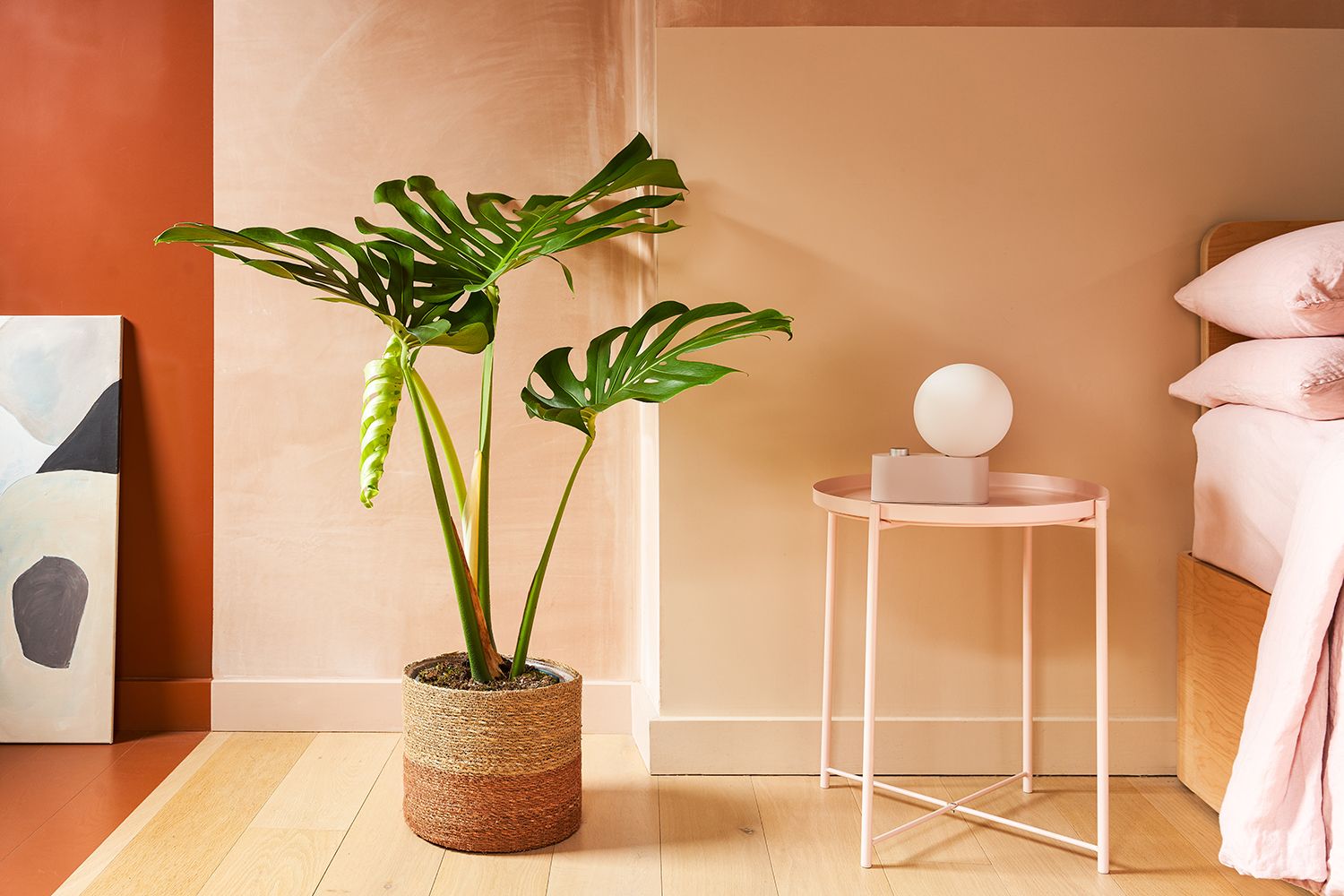
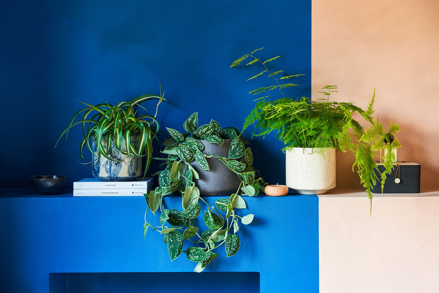
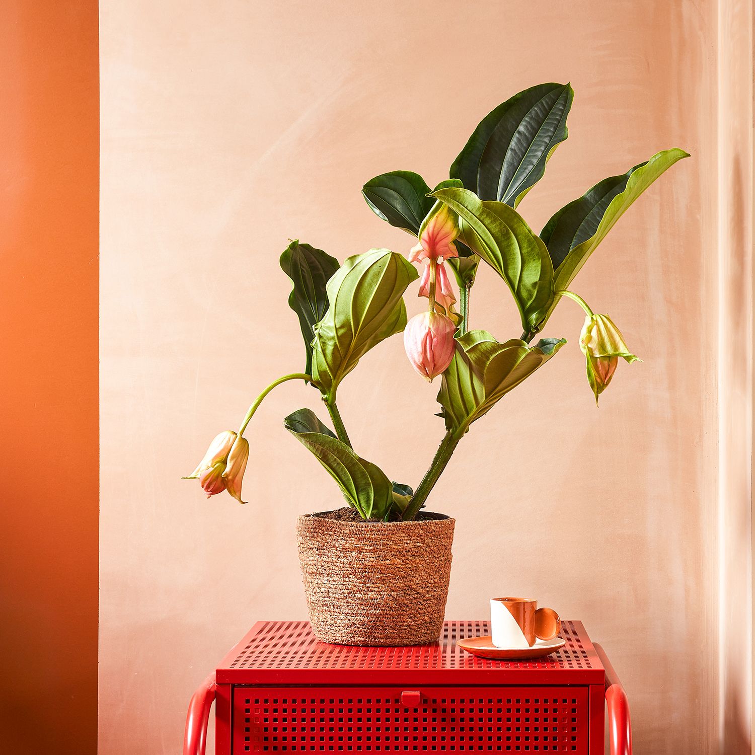
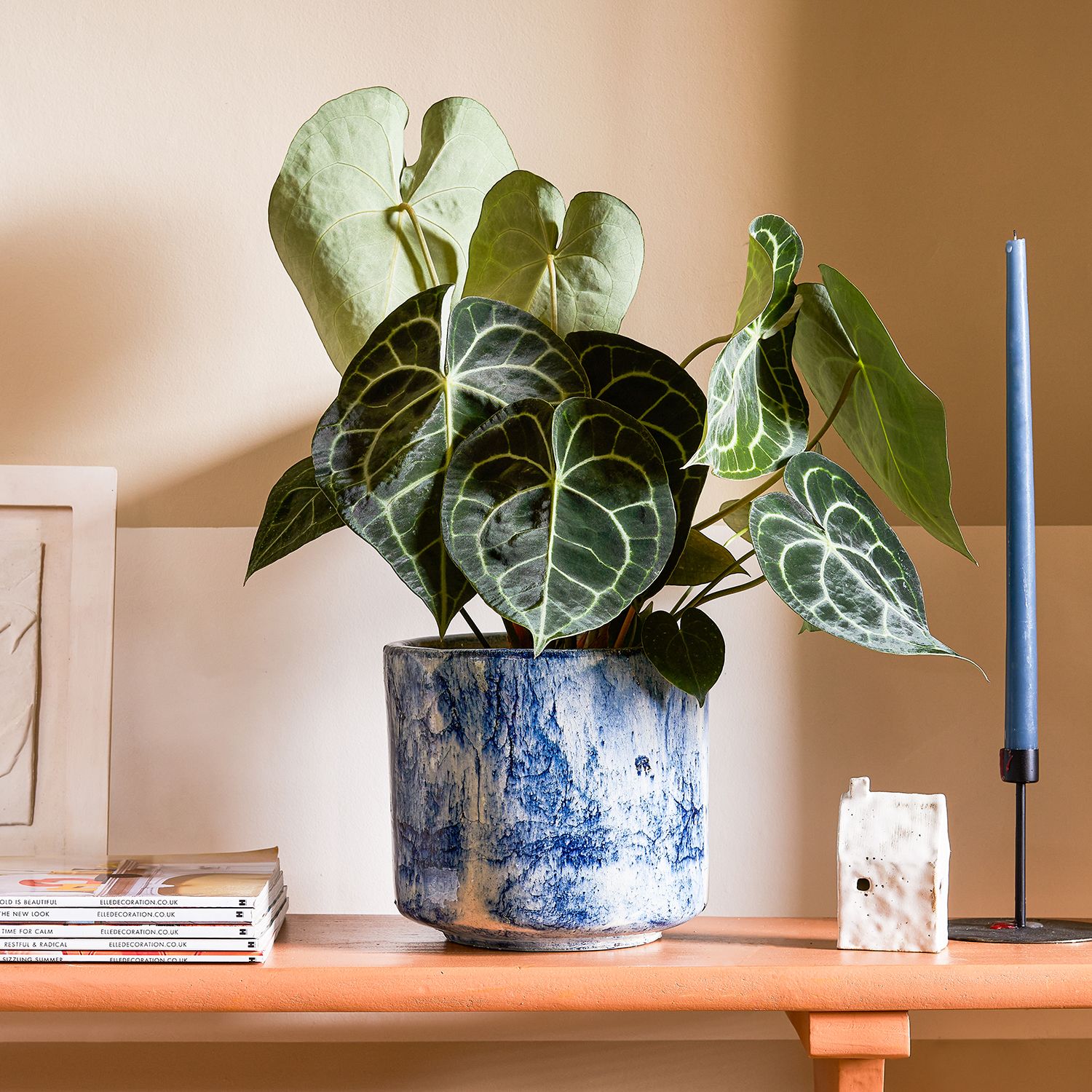
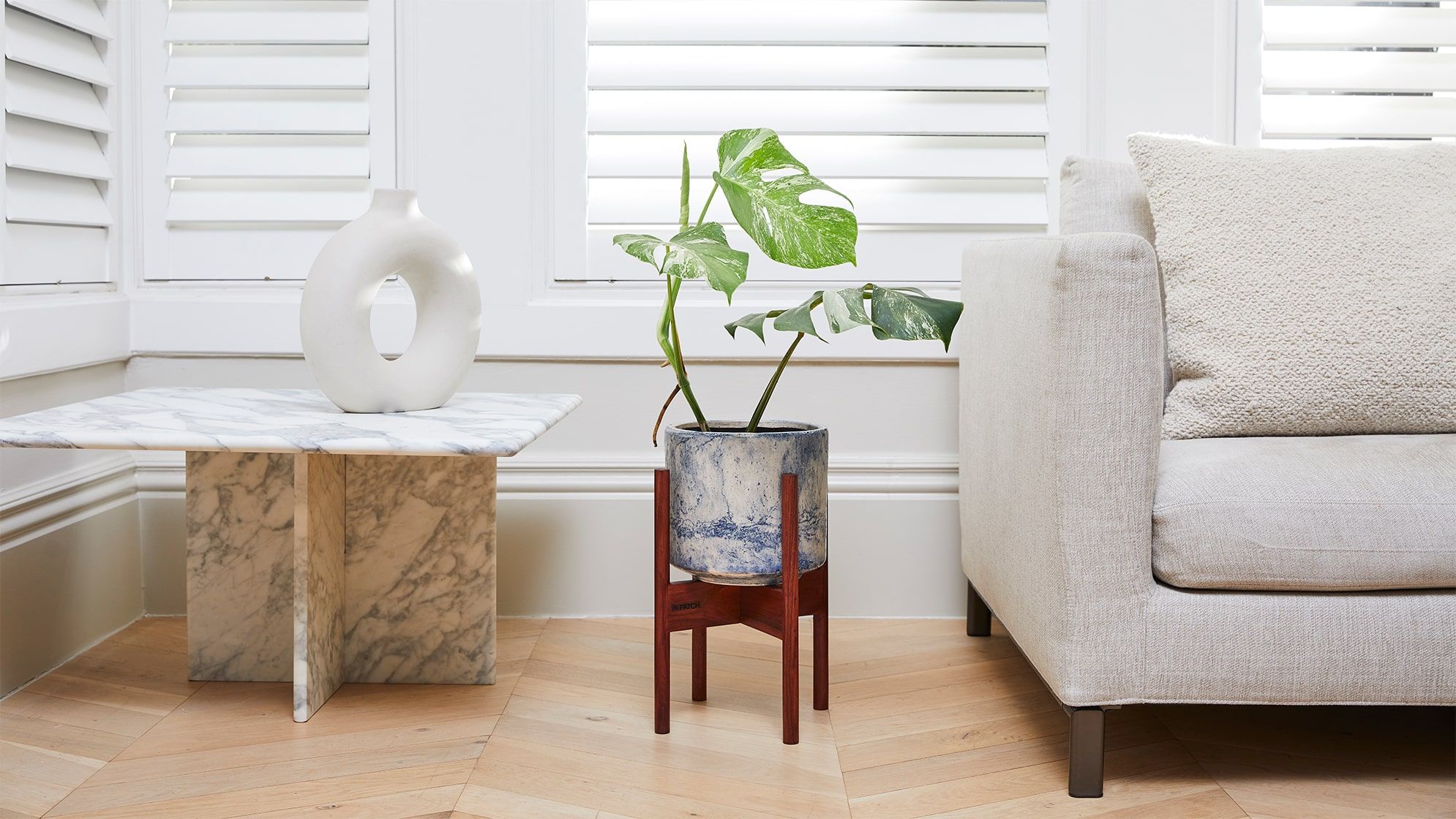
Stripes, primary colours, earthy tones and period features – the backdrop to our AW24 photoshoot has it all. We spent two days in the beautiful House of Colour, which set the stage for our latest houseplants, pots and Christmas trees. The rainbow property was the brainchild of interior designer Rhonda Drakeford, founder of Studio Rhonda, and the property’s owner Rob, who both share a love of colour and pattern. Keen to find out more about the design, we caught up with Rhonda to chat colour palettes, inspirations and mixing the old with the new.
When Rob’s sister Zu sadly passed away in 2020, he decided to redesign the home they once shared with her legacy in mind. He approached Rhonda with a vision to create a space that was bold in style yet still a place where he could relax and unwind. The three-story property is a happy mix of old and new, with the lower two floors in keeping with its Victorian era, and the top floor a modern loft space, providing the bones for a design that balanced modern with classic.
Having initially trained as a graphic designer, Rhonda’s style naturally leans towards bold colours and graphic shapes, two elements she introduced throughout the property. The designer set out to create a journey through the house, using the central staircase as “a way to introduce colours gradually and create dialogue between rooms of differing architectural age”.
To do so, Rhonda reached for a colour palette of 30 different shades, blending earthy tones and bolder, primary hues. “I added different shades of red, yellow and blue to the mix – this is particularly useful in softening bold shots of colour and avoids everything looking contrived or ‘matchy matchy’,” Rhonda says. “I contrasted these colours with earthy tones, which allow space for the colours to breathe and also to soften the atmosphere – using block colours alone can be overpowering and too clinical for a residential space.”
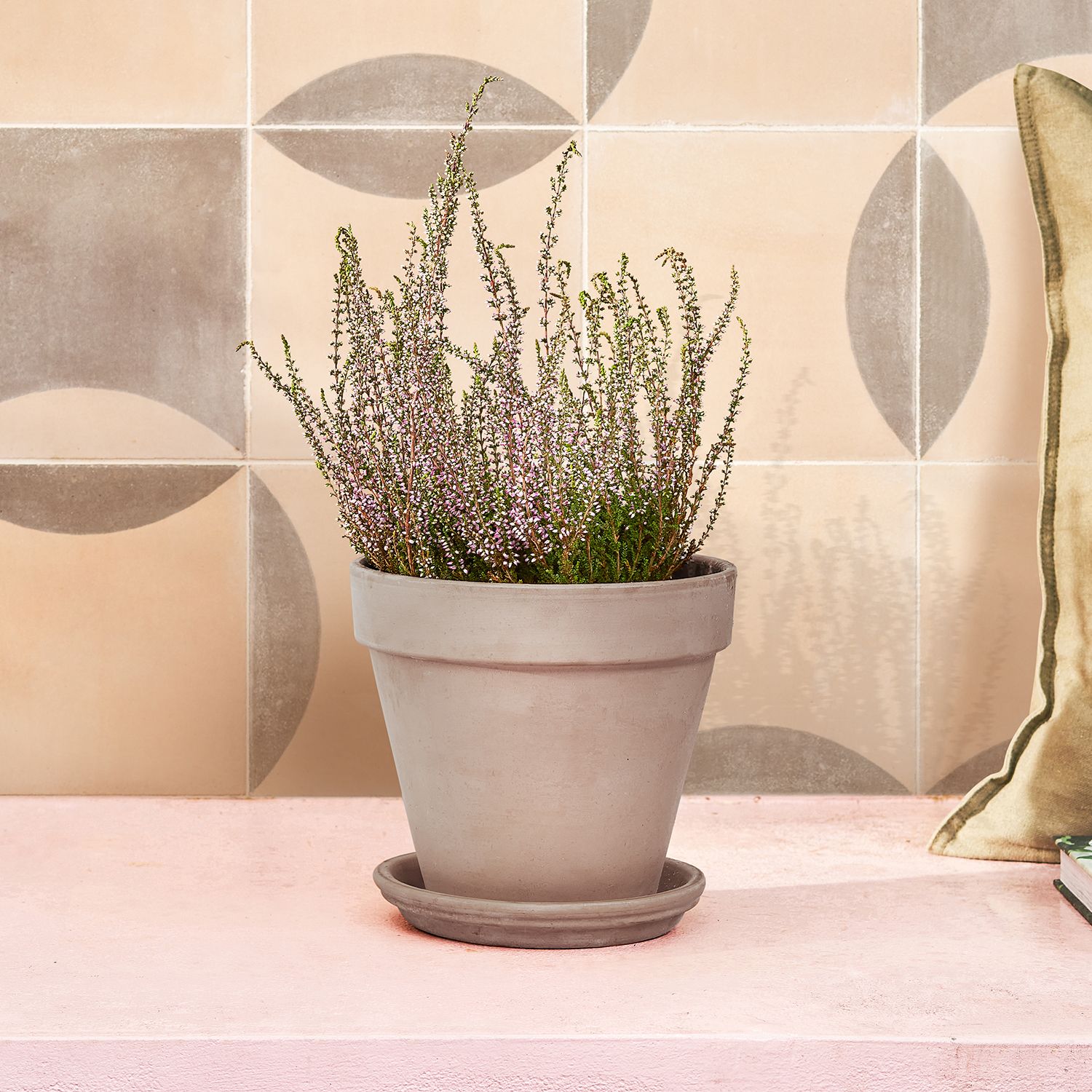
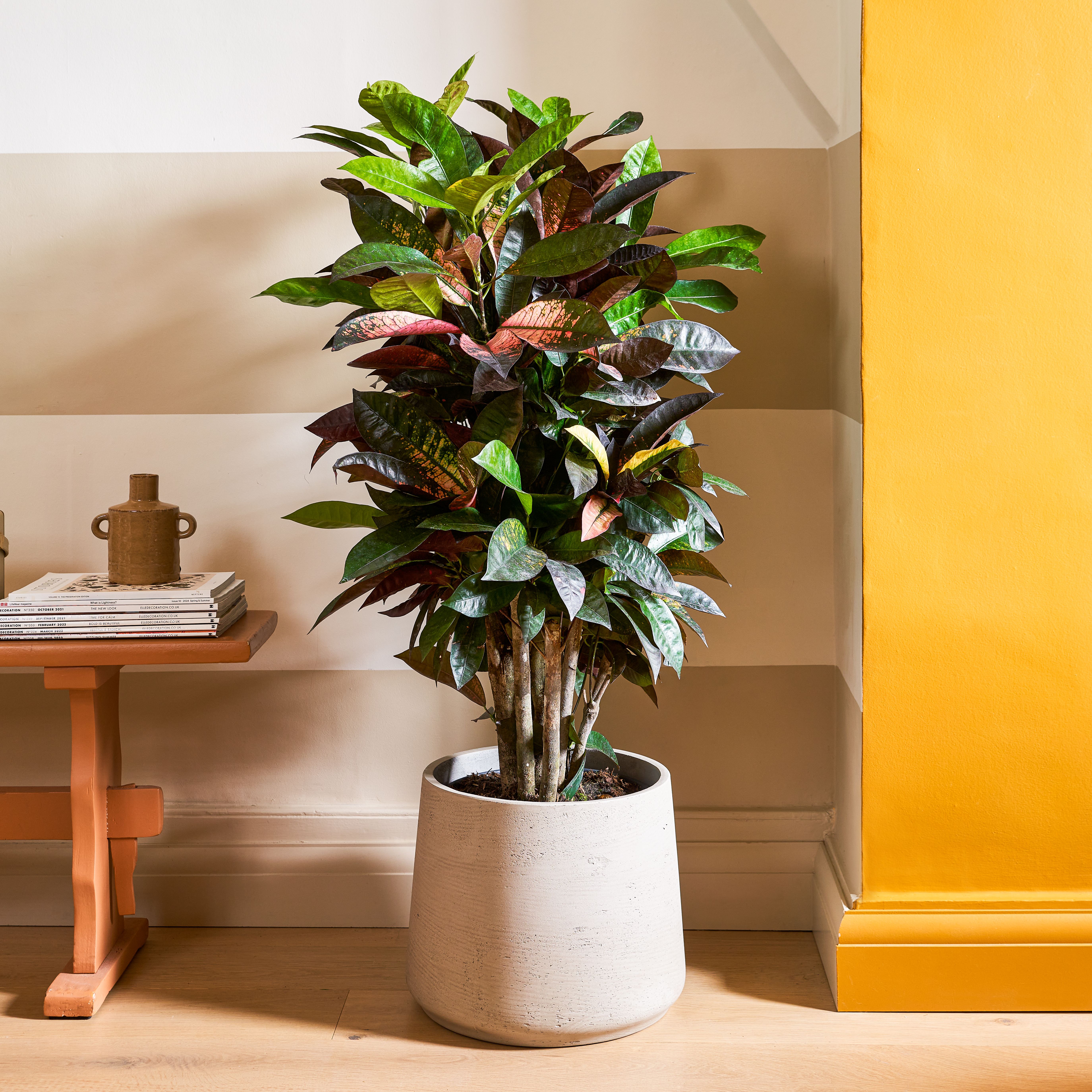
This considered palette provided the perfect backdrop to our Autumn/Winter photoshoot. Bold pops of colour set the stage for our neutral pots, while walls in earthy tones served as a fitting stage for our desert plants. With green being one of the only colours not featured within the house – “Rob was quite set on no greens!” – our leafy plants were able to stand out.
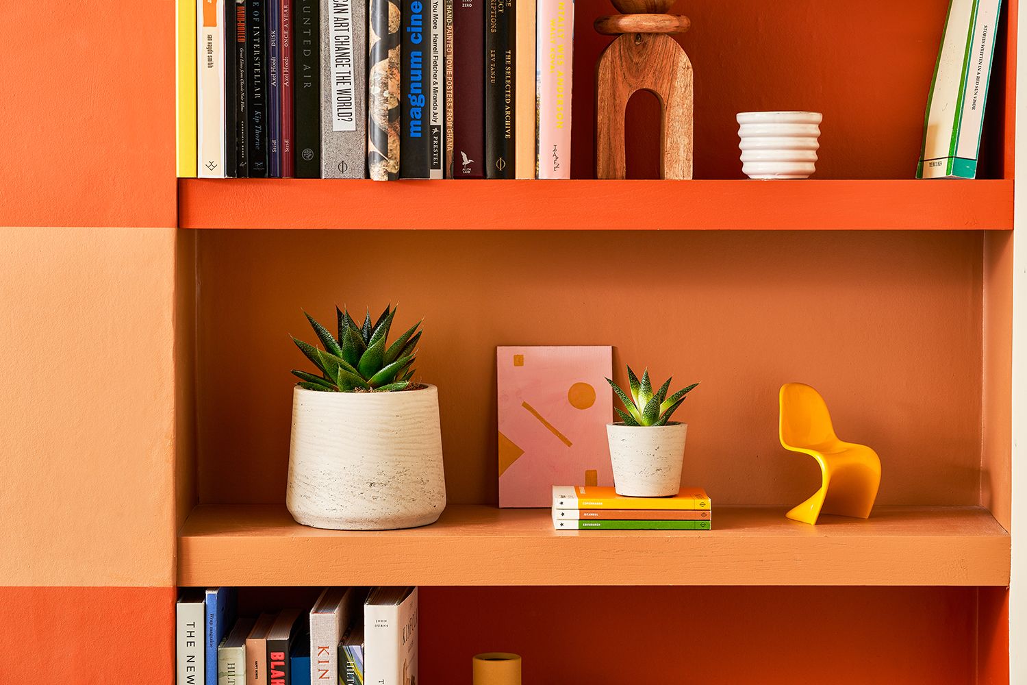
To ensure the contrasting colours worked together, and to create a point of difference between complementary hues, Rhonda layered different finishes, from solid paint to plaster and textured micro-cement. Each core colour had around five or six adjacent shades, building up a cohesive palette. “The placement throughout the house is also important, as well as the scale,” Rhonda says. “One room is predominantly blues, but with small red accents, and other spaces are more earthy, with blue accents.”
The aforementioned staircase is the centre that glues the space together, mixing both linear stripes in earthy tones with a vibrant blue and red that runs throughout. “I love arriving at the top of the house, after passing through and absorbing all the colour used on the floors below,” Rhonda says. “You arrive at a visual pause in colour – the walls of the stairs and landing have only a faint blush stripe painted on the raw plaster pink walls. The adjoining bathroom and bedroom then burst into colour again, making use of the extra natural light.”
When it comes to designing a space, Rhonda always uses the property itself as a starting point, noting its history, the desired functions of the rooms and the personality of those who will be using them. “I love to tell stories with my spaces,” she explains. “In Rob’s home, I used his vast collection of family heirloom Polish spot pottery as the starting point for the decorative painting on the huge cupboard in the living room.”
The next project Rhonda is putting her colourful stamp on is a five-storey furniture showroom in Clerkenwell. In her spare time, she’s renovating her own 1988 VW campervan, a complete contrast in scale. “It’s the most complex design I’ve ever done, with every millimetre meticulously considered to the ensure the exacting functionality, while also creating a beautiful home from home,” she says. “I’m absolutely loving it!” We can’t wait to see it.
Shop the edit


Rewild your inbox
Plant tips. Special offers. No spam.
You might like
Decorate your bathroom with plants
It’s their favourite room to live in
9 ways to decorate with plants
Turn your home into an indoor jungle in no time
How plants help us process trauma
Sue Stuart-Smith explains how nature heals
